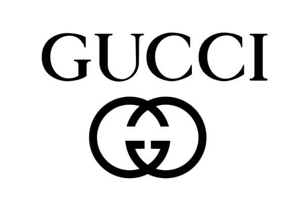
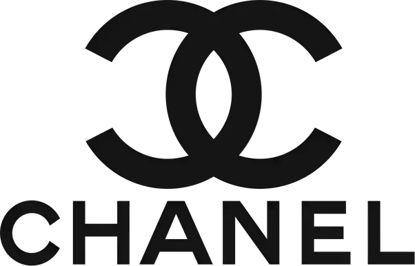
Gucci and Chanel’s logos differ yet share timeless elegance. Gucci’s interlocking Gs exude luxury, while Chanel’s intertwined Cs signify sophistication. Both brands employ minimalist monograms, combining simplicity and distinction, contributing to their global recognition and fashion prominence.
What is with the Gucci and Chanel Logos?
When it comes to Gucci and Chanel, they each have distinct logos that give them an aura of exclusivity and refinement. These two brands stand out because they are not afraid to experiment with their designs and layouts.
They keep designing new looks for their logos, making their brand stand out from other fashion companies. Go through this post to learn more about how these two fashion brands’ logos look similar but still different.
The Gucci Logo

Gucci is the epitome of luxury. It’s known as ‘the people’s luxury’ because it offers a high-end bag that anyone can afford. Gucci is known for its signature GG monogram. The logo is what people associate with Gucci: the double Gs intertwined with each other with a little flourish at the end of each letter.
The company’s logo has evolved over the years. Everyone has seen many logo variations, but the double G has remained the same. The logo has evolved to include a bit more of a geometric design, so it looks slightly different from back in the 1960s.
The Chanel Logo

Chanel is known for its classic and luxurious designs with an aura of exclusivity. Chanel is considered the ‘it’ brand for fashion and luxury, and its logo is a traditional double C. The logo is instantly recognizable, so the company has used it to brand its products and company logo for over a hundred years.
The double C stands for the company’s name, “the House of Chanel.” Over the years, Chanel has experimented with the logo. They’ve changed the color of the C, the font, and the spacing between the letters.
The company experimented with images like a White C on a black background, a C in a circle, or a C on a checkered background.
They’ve also had the C appear on different products, such as a piece of clothing or a beauty product.
How Gucci and Chanel’s Logos Look Different but Still Similar
These two fashion brands have distinct logos. Their logos look different, but they still share similarities. Both logos use type, geometric designs, and images to represent their brands. They are both clean, simple logos that are easy to recognize.
The following are similarities and differences in the brands’ logos:
Similarities
- Both Gucci and Chanel use wordmarks or fonts to depict their brands.
- Both have two-color geometric designs.
- The colors for both logotypes are red and black.
- The font for both is text-based.
- Both logos use one alphabet twice in the design. The letters are interlocked and face opposite directions.
Differences
- Gucci uses two straight vertical lines. Gucci has a thicker top line of the second ‘G,’ and the double lines have no flairs at the end. Chanel has flairs at the end of all their lines.
- Gucci uses a drop tail on the first top circle, whereas Chanel uses double circles with embellishment, swirly on each circle.
- Chanel uses a central line above figures to complete the circles, linking the connection between each circle; Gucci has one small line beneath its decorative circle without any intricate line above the image.
The Gucci Logo Evolution
Over the years, Gucci has changed the design of its logo a lot. If you look at the logo from the 1960s and 1970s, it’s different from the modern logo that you see today.
The original logo, which looked like a bunch of letters intertwined, was more of a typical logo design. As time flew and the fashion industry grew, designers and fashion brands experimented with typefaces. They began using more decorative and artistic fonts.
Some had more graphic elements such as characters, illustrations, or geometric designs. As time went by, the logo became more and more abstract. Everyone has seen a lot of logo designs that merge type and imagery, such as the Chanel logo which features an image of a woman’s handbag.
How Chanel’s Logo Changed Over Time
As is the case of most logos, the Chanel logo has evolved over the years. The logo has gone through many different designs, but it has stayed the same since 1883: two double Cs intertwined together.
The modern logo is more abstract than the double Cs from the 1960s and 1970s. The logo is now primarily a combination of type and imagery. The logo is a lot more colorful and creative than its original design. Today, Chanel’s logo primarily uses type and illustrations.
The logo is primarily an abstract or geometric design, or it can be a combination of type and imagery. It can also feature a circle, a woman’s handbag, or a flower.
How Chanel’s Logo Features Their Iconic Double C
The logo features a double C which stands for the company’s name. The C is iconic and recognizable, making it perfect for a logo.
The logo also features a Chanel logo in the center of the C and has been iconic since 1913. The double C is resting on its side with the Chanel logo in the middle of the C. The double C is Capital, and the logo is located at the logotype bottom and is known as a logogram. It features a lowercase ‘c’ with a rounded corner.
A white shadow behind them also makes them pop off the solid-colored background. Below the information, you will see two lines of text for company and address details. The double C above those lines points to them completing each other.

Why Is a Good Logo So Important?
A good logo is the first impression a brand gives to its customers. It’s essential to have a good logo since it’s what most people associate with a brand and should be memorable, distinctive, and creative.
A logo should also be simple and easy to remember and understand. A good logo is essential because it represents your company’s values, mission, and brand attributes.
An effective logo isn’t just a design; it represents your business and the products or services it offers. A decent logo can make or break a company and is the key to expanding your business. A great logo can get more people interested in your brand, leading to more sales and profit.
A company’s logo is more than a mark. It reflects the company’s values and personality, making it essential to consider when creating a brand identity. This is the case because most people associate logos with the companies they represent, even without looking at them closely.
Companies often register logos as trademarks because they have robust recognition and commercial value worldwide as commercial symbols. People easily connect an image or shape used for goods of a product or service with a brand.
That’s why a company needs to create an original logo for its brand, one that symbolizes its ideas, values, and goals so that customers can remember the name of the company whenever they see it again.
References:
https://www.quora.com/Why-do-the-Gucci-and-Chanel-logos-look-similar
https://www.brandloom.com/gucci-logo-gucci-symbol-explained

